How to Make Business Yard Signs Look Professional, Not Cheap

How to Make Business Yard Signs Look Professional, Not Cheap
Yard signs can be a powerful local advertising tool, but many business owners worry about one thing: will a yard sign make the company look professional, or will it look cheap?
This is a fair concern. A poorly designed sign with too much text, low-quality images, weak colors, or unclear contact information can hurt the first impression. But a well-designed business yard sign can make a local company look active, trustworthy, and easy to contact.
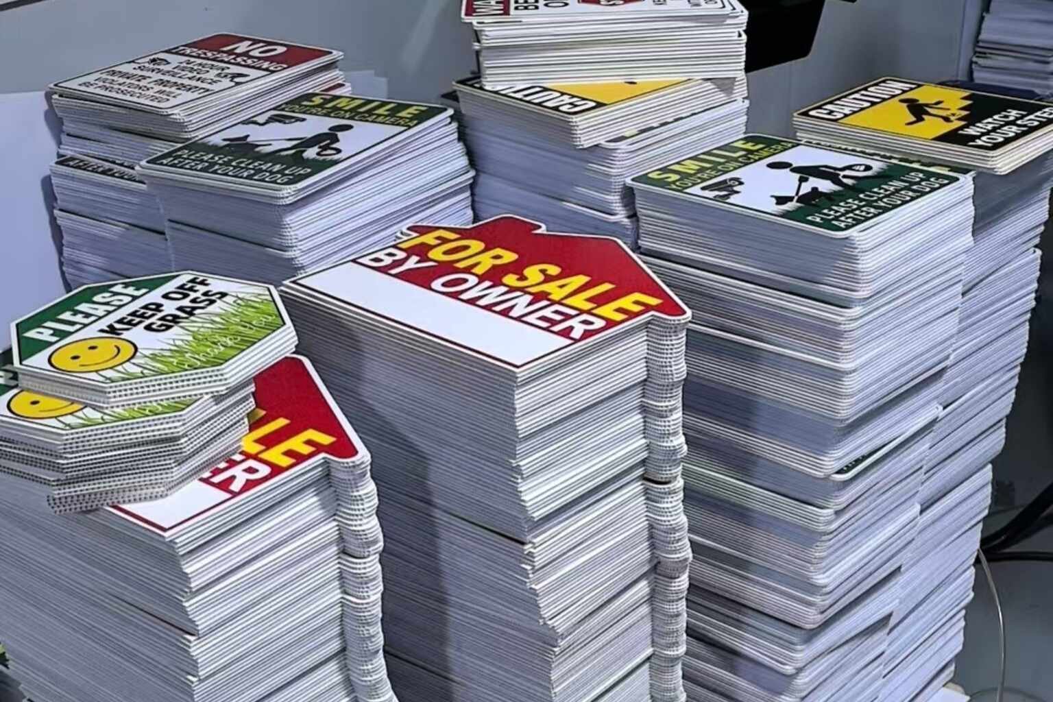
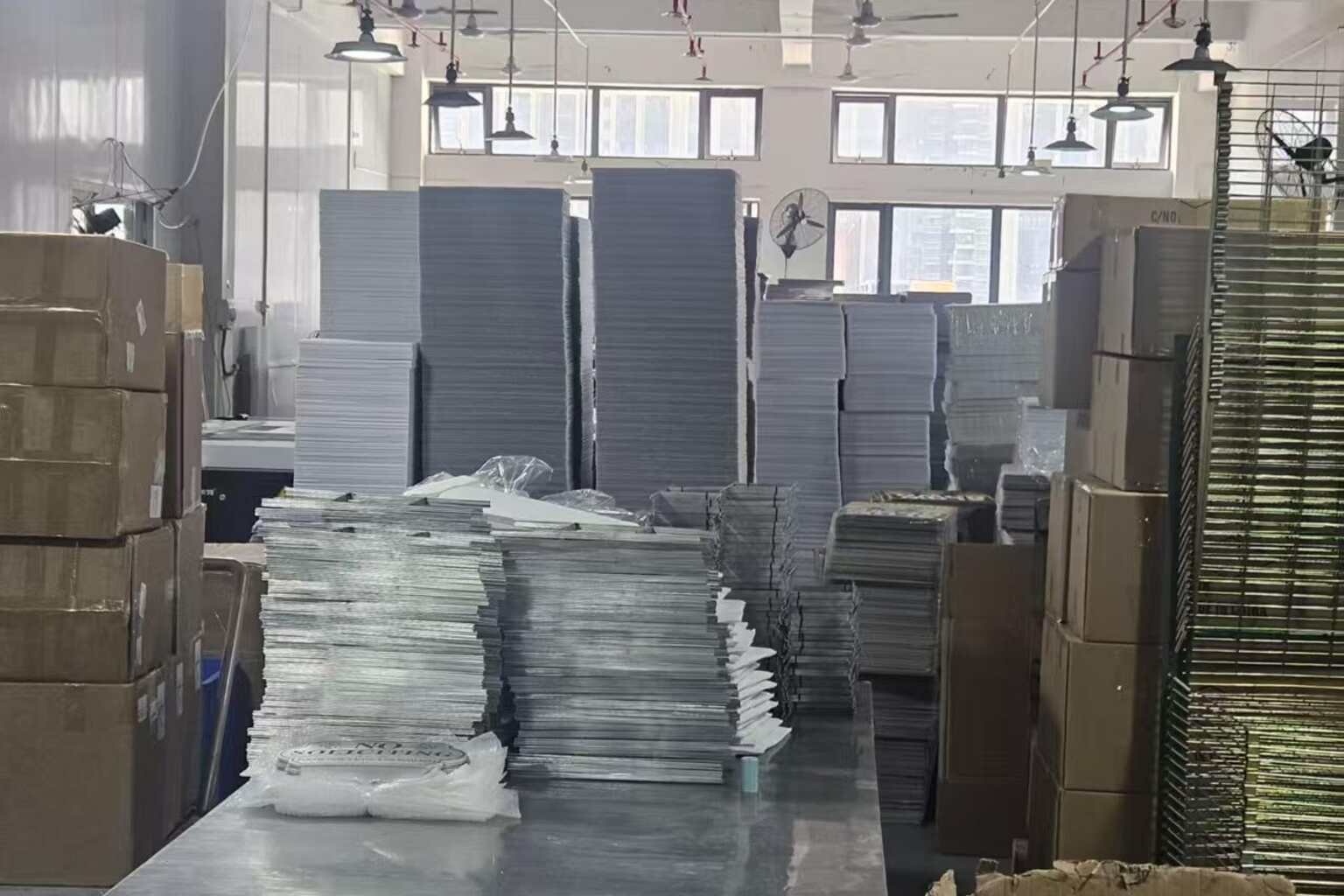
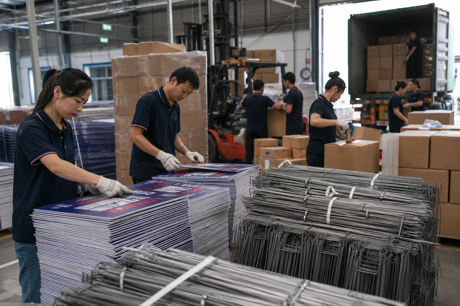
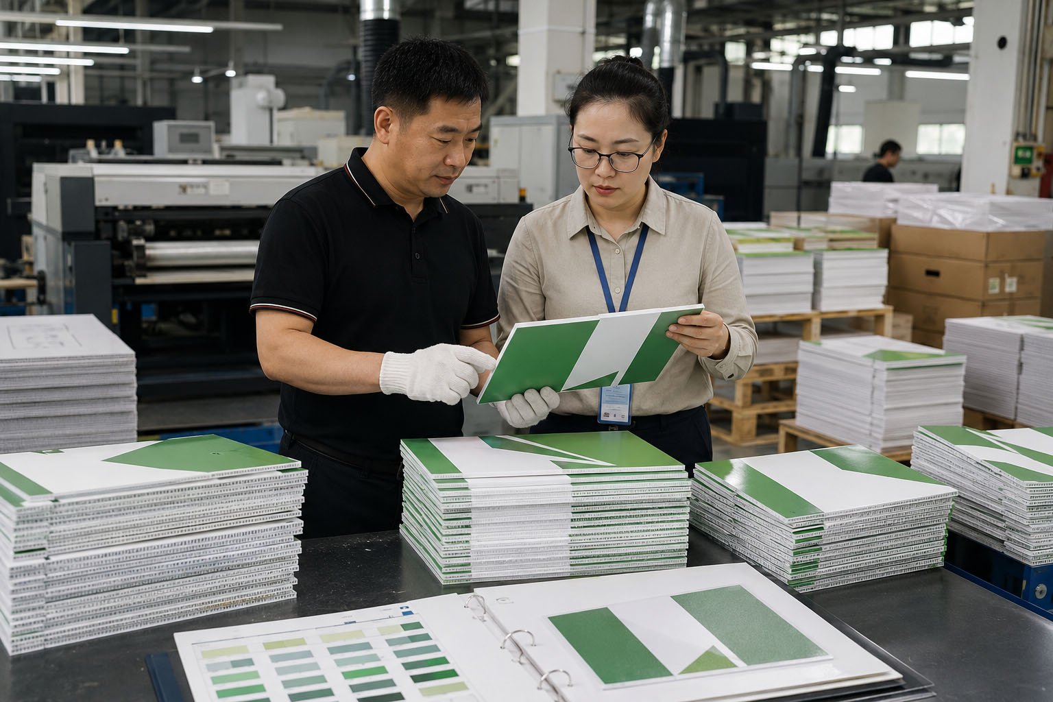
At iYardSign, we manufacture custom business yard signs, coroplast signs, local service signs, event signs, real estate signs, and yard signs with H-stakes for overseas customers. This guide explains how to make business yard signs look professional and avoid common design mistakes.
Quick Answer: What Makes a Business Yard Sign Look Professional?
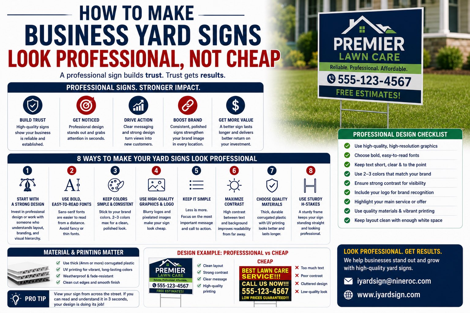
A professional business yard sign has a clear message, readable text, strong contrast, consistent branding, enough white space, high-quality logo files, durable material, and a simple call to action. It should be easy to understand within a few seconds from the street or sidewalk.
The sign does not need to be complicated. In many cases, simpler signs look more professional because they are easier to read and easier to trust.
Why Some Yard Signs Look Cheap
A yard sign usually looks cheap because of poor design choices, not because yard signs are cheap as a product. Even a low-cost coroplast sign can look professional when the layout is clean and the message is clear.
Common reasons signs look unprofessional include:
- Too much text on one sign
- Small phone numbers
- Low-resolution logos
- Weak color contrast
- Too many fonts
- Busy background images
- No clear call to action
- Cheap-looking clip art
- Poor installation or leaning stakes
A business sign should help people feel confident about contacting the company. If the sign feels careless, customers may assume the service is careless too.
1. Start with One Clear Message
The biggest mistake is trying to say everything on one sign. A business yard sign is not a brochure. People may only have a few seconds to read it.
Instead of listing every service, choose one clear message:
- House Cleaning Available
- Free Roof Inspection
- Lawn Care Services
- Pressure Washing
- Local Painting Company
- Scan for a Free Quote
If your business offers many services, consider making different signs for different campaigns instead of crowding all services onto one design.
2. Make the Phone Number Easy to Read
For local businesses, the phone number is often the most important action point. If people cannot read it quickly, the sign may not generate leads.
To improve readability:
- Use a large font size
- Choose a clean font
- Use strong contrast
- Avoid placing the number over a photo
- Keep the number away from the edge
If the sign includes both a phone number and QR code, make sure both are large enough to use.
3. Use Strong Color Contrast
Business yard signs are viewed outdoors, often from a distance. A color combination that looks nice on a screen may be hard to read in sunlight, shade, rain, or from a moving car.
High contrast usually works best:
- Dark text on a light background
- Light text on a dark background
- One bold accent color for attention
- Brand colors used carefully
Avoid low-contrast combinations such as light gray on white, yellow on white, dark blue on black, or thin text over busy photos.
4. Use Your Logo Correctly
A business logo can make a sign look more professional, but only if the logo file is high quality. A blurry or stretched logo can hurt the entire design.
For best results, use vector logo files when available, such as AI, EPS, SVG, or high-quality PDF. If only PNG or JPG files are available, make sure the resolution is high enough for printing.
Do not stretch the logo out of proportion. Keep enough space around it so the brand feels clean and intentional.
5. Choose Fonts That Are Easy to Read
Decorative fonts may look interesting up close, but they are often hard to read outdoors. For business yard signs, readability is more important than style.
Good font choices are:
- Bold
- Simple
- Clean
- Readable from a distance
Use no more than two fonts in one sign design. Too many fonts can make the sign look unorganized.
6. Keep Enough White Space
White space means empty space around text, logos, and graphics. It does not have to be white; it simply means the design has breathing room.
Signs with enough spacing look more professional because the important information is easier to read. Crowded signs feel rushed and harder to trust.
If the design feels too full, remove less important text instead of shrinking everything.
7. Use Photos Carefully
Photos can work on business yard signs, but they should be used carefully. A busy photo background can make text hard to read. Low-quality photos can make the sign look less professional.
Photos are most useful when they directly support the service:
- Before-and-after cleaning
- Landscaping results
- Roofing or remodeling work
- Food product images
- Real project photos
If the photo is not strong, a clean color background may look more professional.
8. Add a Clear Call to Action
A professional sign should tell people what to do next. Without a call to action, people may notice the sign but not respond.
Useful calls to action include:
- Call for a Free Quote
- Scan to Book
- Request an Estimate
- Visit Our Website
- Text Us Today
- Schedule Service
The call to action should match the customer journey. If your business depends on quote requests, make the sign push people toward a quote.
9. Use QR Codes Without Making the Sign Crowded
QR codes can make business yard signs more useful because they connect offline visibility with online action. But the QR code must be large enough and placed clearly.
For QR code signs:
- Use a short call to action near the code
- Keep the code on a clean background
- Leave enough space around it
- Test the code before printing
- Link to a mobile-friendly page
A QR code should make the sign easier to use, not more complicated.
10. Match the Sign to the Business Type
Different businesses need different visual styles. A law office, cleaning company, landscaping business, roofing contractor, restaurant, and daycare should not all use the same design style.
Examples:
- A cleaning company may use clean colors and simple icons.
- A landscaping company may use green tones and outdoor visuals.
- A roofing company may use bold, trustworthy colors.
- A restaurant may use strong food imagery or offer-based signs.
- A professional service business may need a more restrained design.
The sign should feel appropriate for the service and the customers you want to attract.
11. Choose the Right Material
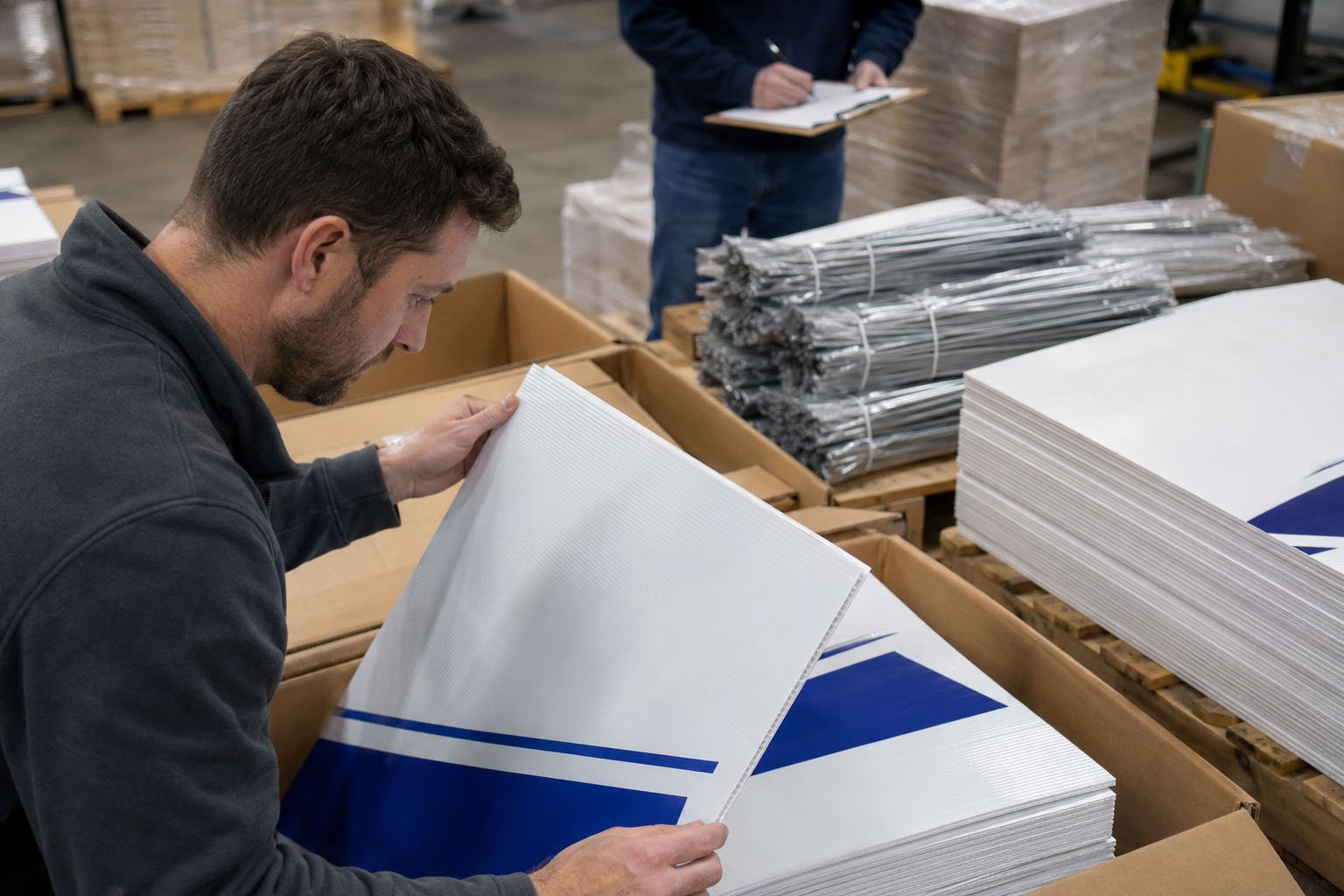
Material also affects how professional the sign looks. Corrugated plastic, also called coroplast, is widely used for business yard signs because it is lightweight, affordable, weather-resistant, and suitable for H-stakes.
For most temporary outdoor business promotions, coroplast is a practical choice. For longer-term displays or premium locations, buyers may need stronger materials or frames.
Before ordering, confirm:
- Material type
- Material thickness
- Outdoor use suitability
- Printing method
- Stake or installation option
12. Install Signs Straight and Cleanly
Even a well-designed sign can look unprofessional if it is installed poorly. A leaning, dirty, damaged, or badly placed sign can reduce trust.
Installation tips:
- Use the correct H-stakes
- Install signs in stable ground
- Keep signs level
- Face signs toward the viewer
- Avoid blocked locations
- Remove signs after the campaign ends
Good placement and clean installation help the sign look intentional and professional.
Professional Business Yard Sign Checklist
Before printing business yard signs, check:
- Is the message short and clear?
- Can the sign be read from a distance?
- Is the phone number large enough?
- Is the logo high quality?
- Are the colors high contrast?
- Are fonts easy to read?
- Is there enough white space?
- Is the QR code tested?
- Is the call to action clear?
- Is the material suitable for outdoor use?
FAQ About Professional Business Yard Signs
Do yard signs make a business look cheap?
Not if they are designed well. A clean layout, readable text, strong branding, good material, and professional installation can make business yard signs look trustworthy and effective.
What should be on a business yard sign?
A business yard sign should include a clear service message, company name or logo, phone number or website, and a simple call to action. A QR code can also be useful.
What makes a yard sign easy to read?
Large text, high contrast, simple fonts, short messages, and enough white space make a yard sign easier to read outdoors.
Should business yard signs include a QR code?
QR codes can be useful if they link to a quote form, booking page, offer page, or business website. The code should be large, tested, and easy to scan.
What material is best for business yard signs?
Corrugated plastic is commonly used for business yard signs because it is lightweight, cost-effective, weather-resistant, and easy to install with H-stakes.
Custom Professional Business Yard Signs from iYardSign
Professional business yard signs can help local companies build visibility, generate leads, and create a stronger first impression. The key is to keep the message clear, the design readable, and the production details reliable.
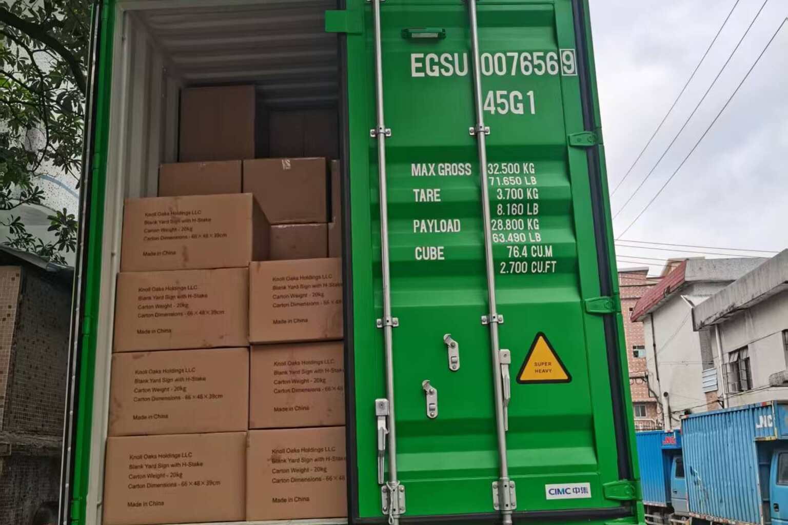
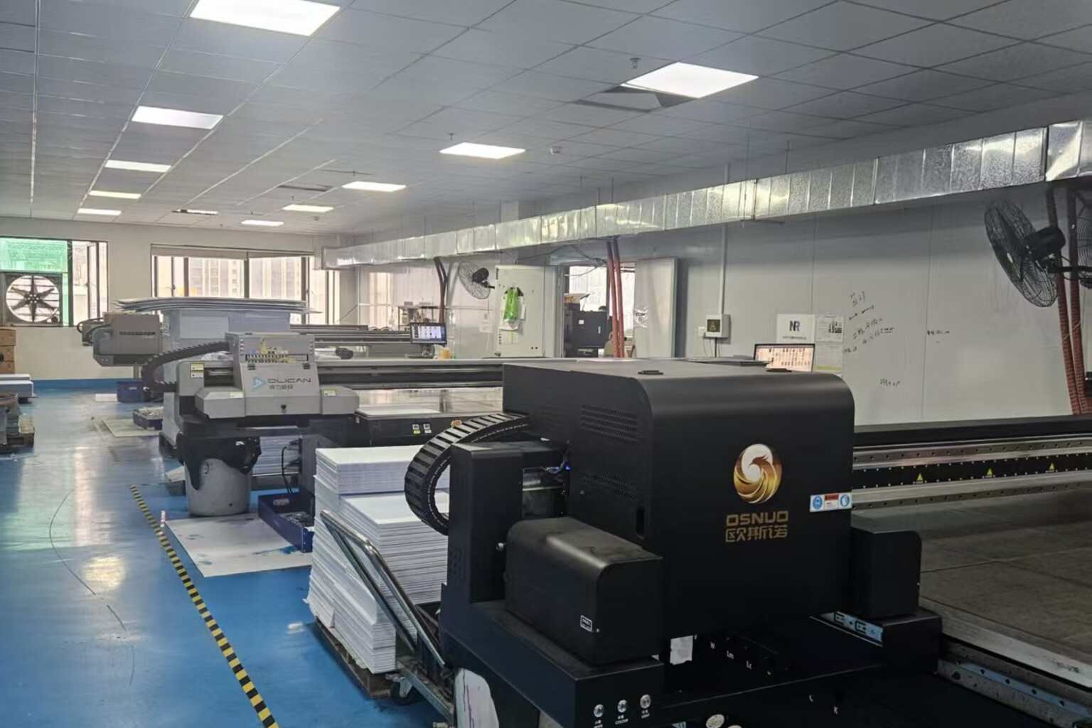
iYardSign manufactures custom business yard signs, coroplast signs, local service signs, event signs, real estate signs, promotional signs, and yard signs with H-stakes. We support full-color printing, custom sizes, artwork review, QR code signs, bulk orders, packaging, and shipping coordination.
Need professional business yard signs for your local promotion? Send iYardSign your design, size, quantity, and delivery requirements to get a factory quote.