Yard Sign Readability: How to Make Signs Easier to Read from the Road

For printing companies, sign shops, distributors, and local service businesses, creating readable signs is not simply a matter of choosing a large font. Text hierarchy, color contrast, spacing, viewing distance, and the amount of information all affect how easily a sign can be understood.
Whether you are producing signs for roofing contractors, lawn care companies, pressure washing businesses, real estate professionals, or promotional campaigns, a consistent design process can help make each sign easier to read and more professional.
Quick answer: To improve yard sign readability, use one clear headline, a simple typeface, strong contrast between text and background, a prominent phone number, and enough spacing around important elements. Review the complete artwork at its intended print size before approving a bulk order.
Why Yard Sign Readability Matters for Business Advertising
A yard sign is often viewed from a distance, at an angle, or while someone is moving past it. Unlike a brochure or website, it does not give the viewer much time to study detailed information.
If the headline is too small, the colors blend together, or too many messages compete for attention, viewers may not understand what the business offers.
Common design problems include:
- Too many words competing for attention
- Small phone numbers and website addresses
- Decorative fonts that are difficult to recognize
- Insufficient contrast between text and background
- Important information placed too close to the edges
- Photographs or illustrations that compete with the headline
- Too many colors, fonts, and visual effects in one design
For businesses using yard signs to generate local inquiries, the objective is straightforward: communicate the main message clearly, identify the business, and make the next step easy to understand.
A readable sign cannot guarantee more calls or sales, but it helps reduce unnecessary barriers between the message and the viewer.
1. Start with One Main Message
The first step toward better yard sign readability is deciding what the sign needs to communicate.
A common mistake is trying to include every service, discount, certification, social media account, and contact method on a single sign. This can make the design crowded and weaken the main message.
Before creating the artwork, answer three questions:
- What is the most important message?
- Who needs to understand it?
- What should the viewer do next?
For example, a roofing contractor may prioritize the service and phone number. A lawn care company may emphasize weekly service, while a real estate sign may focus on a property listing or an open house.
A practical layout usually includes:
- Main headline: Communicates the service, offer, or primary message.
- Business identity: Shows the company name or recognizable logo.
- Call to action: Provides a phone number, website, or other useful next step.
- Supporting information: Adds only the details needed to understand the offer.
Not every sign needs all four elements at the same visual prominence. Choose the layout according to the campaign’s purpose.
2. Build a Clear Visual Hierarchy
Visual hierarchy determines which information viewers notice first, second, and third. It helps organize the design so that the most important message does not get lost among secondary details.
The following table provides a practical starting point for business yard signs.
| Design Element | Primary Purpose | Practical Recommendation |
|---|---|---|
| Headline | Communicates the main message | Use short, direct wording and prominent lettering |
| Logo or business name | Identifies the company | Keep the branding recognizable and uncluttered |
| Phone number | Makes contact information easy to find | Use clear numerals and sufficient spacing |
| Supporting details | Provides additional context | Keep secondary information brief |
The exact order depends on the sign’s purpose. A directional sign may need its arrow to stand out first, while a contractor’s sign may need the service and phone number to receive the most attention.
3. Choose Fonts That Are Easy to Read
Typography affects how quickly viewers recognize words and numbers. A font that looks attractive on a large computer screen may become difficult to read when printed at a smaller size.
For most business yard signs, simple and clearly shaped lettering is a practical choice.
Consider the following guidelines:
- Use straightforward fonts for headlines, phone numbers, and essential instructions.
- Avoid elaborate script fonts for important contact details.
- Limit the design to a small number of complementary font families.
- Maintain sufficient spacing between letters and lines.
- Avoid placing essential text over visually busy images.
- Use decorative typography selectively for logos or short brand elements.
For example, a company name may work well in a distinctive display font, while the phone number below it should use clear, familiar numerals.
The goal is not to eliminate creativity. It is to make sure the creative elements support the message rather than compete with it.
Before approving the artwork, inspect the text at the actual intended print size. Check whether the headline and phone number remain distinguishable without zooming in.
4. Use Strong Color Contrast
Color contrast helps separate text from its background. A colorful sign can attract attention, but attractive colors alone do not guarantee good readability.
For example, light gray lettering on a white background may be difficult to recognize. Bright yellow text on a similarly bright background can also lose definition.
To improve contrast:
- Choose text and background colors that are clearly distinguishable.
- Use dark text on a light background or light text on a dark background when appropriate.
- Avoid placing small text over photographs with many colors or details.
- Use accent colors selectively to emphasize important information.
- Check how the entire color combination looks when reduced to the finished sign size.
Design tip: Temporarily preview the artwork in grayscale or at a reduced size. If the headline and phone number blend into the background, reconsider the color contrast, font weight, or layout before production.
Color selection should also reflect the brand. The best result balances brand consistency with clear separation between the message and its background.
5. Make Phone Numbers and Contact Details Easy to Find
For many local service businesses, the phone number is one of the most important parts of a yard sign.
Roofing contractors, lawn care companies, cleaning services, and pressure washing businesses may use yard signs to introduce their services to people in nearby neighborhoods.
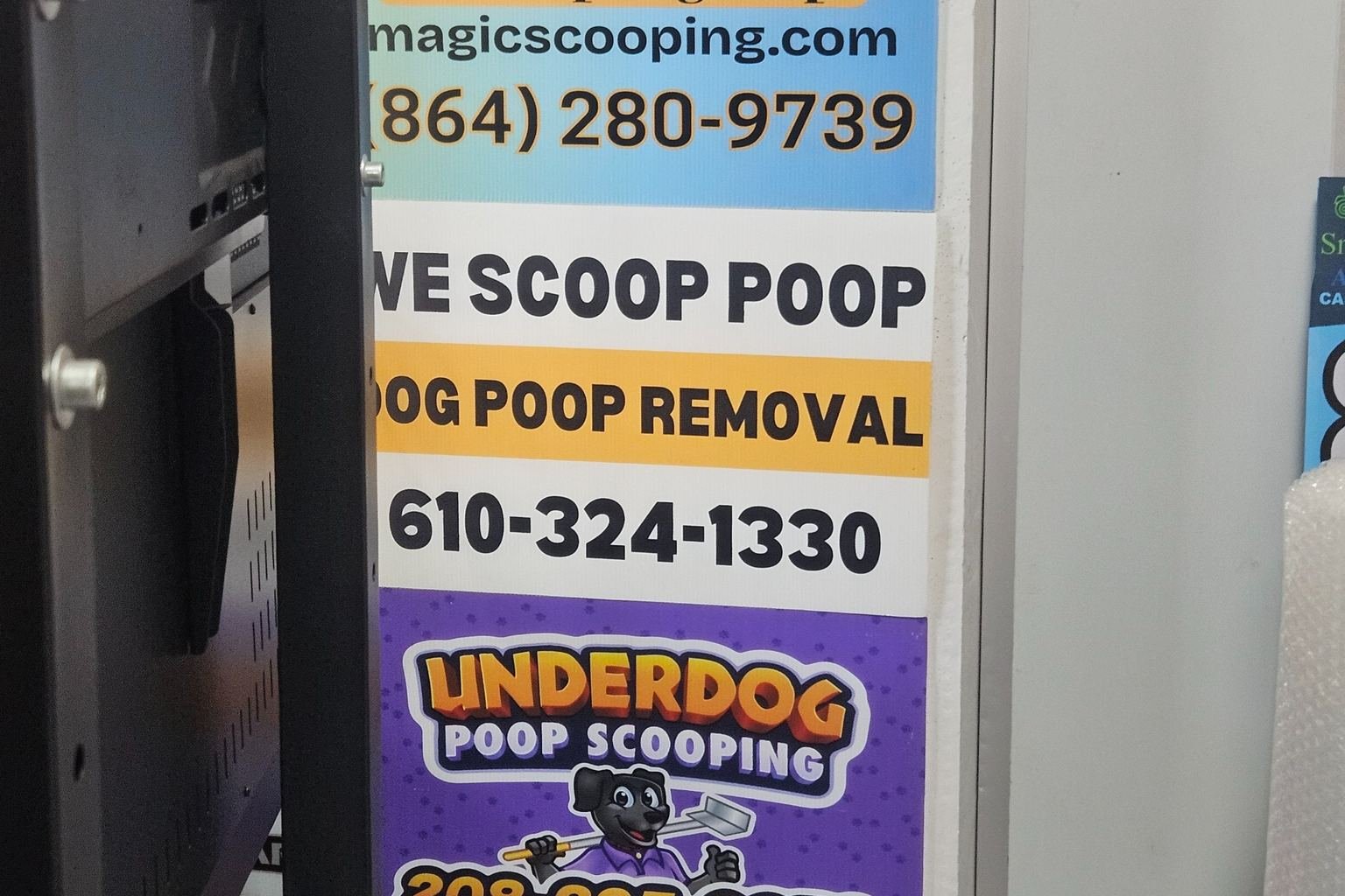
A phone number can lose its impact when it is squeezed into a narrow space, printed in a decorative font, or surrounded by too many competing elements.
Use these practical checks:
- Give the phone number enough space to remain visually distinct.
- Use clear numerals and consistent spacing.
- Avoid unnecessary shadows, outlines, and decorative effects that reduce clarity.
- Keep the number away from cut lines and edges.
- Verify every digit against the customer-approved artwork.
- Check that the website address and business name are also correct.
For bulk orders containing multiple designs, organize the artwork by design ID, customer, branch, or service area. This makes it easier to verify that the correct contact information appears on each sign.
A visually clear number is only useful if it is accurate. Proofreading should therefore be part of the production approval process, not an optional final step.
6. Adapt the Design to the Viewing Environment
Different applications require different layouts. A sign placed beside a residential driveway may be viewed by pedestrians, while a roadside sign may be seen only briefly by people passing in vehicles.
The design should reflect how and where people are expected to encounter the sign.
- Roadside advertising: Prioritize a short headline, strong contrast, and minimal supporting text.
- Job-site signs: Make the service and business identity easy to recognize.
- Directional signs: Give arrows and destination instructions sufficient prominence.
- Real estate signs: Emphasize the property message, agent or company identity, and relevant contact information.
- Event signs: Highlight the event name, location, date, or required action.
- Residential service signs: Keep the layout simple and the service message prominent.
Avoid using long paragraphs or tiny details for signs intended to be viewed quickly. The main message should be understandable without requiring viewers to stop and study the entire design.
Placement rules can also vary by location. Before installing signs near roads or in public rights-of-way, check the applicable local requirements.
7. Review the Artwork at the Actual Print Size
A design may look clear when enlarged on a monitor but become difficult to read after printing. Reviewing the artwork at its intended physical dimensions helps identify problems before a bulk order enters production.
For a common 18 × 24 inch yard sign, check the following:
- Finished dimensions and horizontal or vertical orientation
- Headline size and font weight
- Phone number and website readability
- Contrast between text and background
- Spacing around logos, illustrations, and text
- Safe margins, bleed, and cutting requirements
- Correct artwork version for every design
- Consistency between the approved proof and production file
For orders containing multiple designs, review each version separately. A proof approved for one design does not automatically verify the other designs in the same order.
If a physical proof or sample is available, it can provide an additional opportunity to inspect the printed result. The appropriate proofing method depends on the project requirements and production arrangement.
8. Use a Consistent Yard Sign Readability Checklist
Print shops, sign companies, distributors, and multi-location businesses can use a shared checklist to standardize artwork reviews.
Before approving production, confirm that:
- The main message is easy to identify.
- The headline uses readable typography.
- The phone number or call to action is easy to locate.
- Text and background colors have sufficient contrast.
- Unnecessary information has been removed.
- Important elements have enough space around them.
- Text is not too close to cut lines or finished edges.
- Business names, phone numbers, and website addresses are correct.
- Every artwork variation has been checked at the intended size.
- The final approved production files are clearly identified.
Using the same process for every project helps reduce avoidable artwork errors and makes communication between buyers, designers, and manufacturers more consistent.
How iYardSign Supports Custom Yard Sign Production
iYardSign is a China-based manufacturer of custom corrugated plastic yard signs for printing companies, sign shops, distributors, resellers, campaign suppliers, and multi-location businesses.
For bulk projects, buyers can provide approved artwork, sign dimensions, printing requirements, quantities by design, and H-stake specifications. Multiple designs can be organized according to the agreed production and packing plan.
Before production begins, buyers should verify:
- Artwork dimensions and orientation
- Final text, business names, and phone numbers
- Printing and cutting requirements
- Quantities for each design
- H-stake requirements
- Packing instructions and delivery destination
Clear artwork approval helps both the buyer and manufacturer work from the same specifications. For repeat orders, retaining approved design files and revision identifiers can also help maintain consistency across future production runs.
Need Custom Yard Signs for a Bulk Order?
If you are a print shop, sign company, distributor, or reseller looking for a manufacturing partner, iYardSign can discuss your custom yard sign requirements.
Send your artwork, quantity by design, sign dimensions, H-stake requirements, and delivery destination so our team can review your project.
Frequently Asked Questions About Yard Sign Readability
What makes a yard sign easy to read?
A clear headline, readable fonts, strong color contrast, limited supporting information, and a well-organized layout all help improve yard sign readability. The design should reflect the intended viewing distance and environment.
Should a yard sign include every service a company offers?
Usually not. Prioritize the service or offer most relevant to the campaign. Too many messages can make the design crowded and reduce the prominence of the main headline.
How can I make a yard sign phone number more noticeable?
Use clear numerals, adequate spacing, strong contrast, and a layout that separates the number from secondary information. Verify every digit against the final approved artwork before production.
Does a readable yard sign guarantee more customer inquiries?
No. Readability helps people understand a message, but actual responses also depend on placement, audience, offer, timing, competition, and other factors.
Can different yard sign designs be included in one bulk order?
Multiple designs can be discussed for a bulk order. Buyers should provide the quantity and approved artwork for each version, together with the required dimensions, printing details, stakes, packing instructions, and delivery destination.
Why should I review the actual print size before ordering?
Text and design elements can appear different at finished size than they do on an enlarged computer screen. Reviewing the intended dimensions helps identify readability, spacing, and margin problems before production.
Final Thoughts
Effective yard sign design begins with a message people can understand quickly. A clear headline, readable typography, strong color contrast, organized contact information, and careful artwork review all contribute to better yard sign readability.
For businesses ordering hundreds or thousands of signs, a consistent approval checklist also helps keep multiple designs organized and reduces avoidable errors before production.
iYardSign supports custom yard sign manufacturing for B2B buyers who need coordinated artwork, bulk production, and international delivery.